 munirahijazi
 United Arab Emirates
Buyer
Joined: Jan 16, 2013
Posted On: Jan 21, 2013
Overall (too crowded , less is more)
Colours are too matte
Reminder: photography studio is targetting upperclass families.
#117 - Love how to M is fiercely pulling take. Letters are too jerky , would look simpler if other letters were more straight
#95 - Very Elegant and RICH. I dont like the camera or film strip. I like the letter I, can u add a photography element in a more creative way?
#124 Colours were nicer, need something brighter, the M is too curved. can you keep it like original but with the twist around the e? trying to make it look more like #5.
can u change the camera and rainbow style to something different , something more rich?
#5 is simpler but looks like a nursery
#147 COOL concept, but i dont want a character that tells its a girl or a boy. i like the hands squashing mine!
#15 its simpler and clearer here overall, font size and spacing nicer, colours are nicer too but i like the M pulling the E from one side
#138 smaller pics is nicer. but the m pulling the e is much nicer than the E pulling the M here.
#127 i dont like the camera coloured, nor the position nor the rainbow film. the rest is unique.
#52 I like the attitude, maybe one letter is enough? nice colours.
#134 - Clean and neat but too sharp for kids
munirahijazi
United Arab Emirates
Buyer
Joined: Jan 16, 2013
Posted On: Jan 21, 2013
Overall (too crowded , less is more)
Colours are too matte
I dont get why everyones sketching the rainbow and camera same way. I dont like it, but need something to show its a photography studio
#117 - Love how to M is fiercely pulling take. Letters are too jerky , would look simpler if other letters were more straight
#95 - Very Elegant and RICH. I dont like the camera or film strip. I like the letter I, can u add a photography element in a more creative way?
#124 Colours are dull, the M is too curved. can you keep it like original but with the twist around the e? trying to make it look more like #5.
can u change the camera and rainbow style? #5 is simpler but looks like a nursery
#147 COOL concept, but i dont want a character that tells its a girl or a boy. i like the hands squashing mine!
#15 its simpler and clearer here overall, font size and spacing nicer, colours are nicer too but i like the M pulling the E from one side
#138 smaller pics is nicer. but the m pulling the e is much nicer than the E pulling the M here.
#127 i dont like the camera coloured, nor the position nor the rainbow film. the rest is unique.
#52 I like the attitude, maybe one letter is enough? nice colours.
#134 - Clean and neat but too sharp for kids
munirahijazi
United Arab Emirates
Buyer
Joined: Jan 16, 2013
Posted On: Jan 19, 2013
OK looks like everyone sticking to the same style now.
I need something more simple, elegant and yet cute. most new enteries are too bulky and templatey.
Consider the meaning of " take mine (my photo"
munirahijazi
United Arab Emirates
Buyer
Joined: Jan 16, 2013
Posted On: Jan 18, 2013
I would like to bond the M to pull the word Take. To show possessiveness and attitude. Not just use a different font. Show it being pulled and bent. MyToy image will help show how it bonds.
Logos need to also show photography elements. Not lolipops and rainbows! it looks like a nursery or food shop!
I need attitude in the typography of MINE, (pulling possessiveness etc)
#52 Its expressive , but I dont like the way TAKE is, and the letters are too spreaded away. and maybe you can customise the attitudes? eye lashes different fingers? etc
#51 Id like to curve the M and show more pulling force. The camera looks too bulky. and overcrowded. the slogan is also overcrowding
#47 it looks like a play area/ nursery!
#45 Its unique. Shows photograph elements. I like the font. But would be great to keep the font and make the Mine look like its pulling something forcefully.
I like how the pictures are close to each other and didnt like the new updates , too much details. first one is best.
#55 & #54 too pictorial. I like simplicity to have them printed on deep photos.
#41 #2 , MINE is pretty and simple. I wish you could just put take beside it one plain colour. and have the M look like its pulling the word TAKE or the letter E (check out MY TOY IMAGE)
and grey is much nicer than black.
munirahijazi
United Arab Emirates
Buyer
Joined: Jan 16, 2013
Posted On: Jan 17, 2013
I dont like the changes I asked for recently!
Please dismiss and only concentrate on MY TOY. Have Mine connecting to Take. the word Mine should pull Take.
Keep it simple, and ignore the uploaded illustrations i requested last.
Keep it simple like the last ten images.
the first 4 images are the style of my photography
munirahijazi
United Arab Emirates
Buyer
Joined: Jan 16, 2013
Posted On: Jan 17, 2013
#2 Elegant and simple and font is unique. but still dont like the take on top.
#15 looking better. Maybe the elements can be more related to Camera, Flash, Film Strip, etc.
PLEASE CHECK OUT the image I just uploaded MY TOY, Id like to link the M from mine to take in someway!
#11, too pinky and curvey (too feminine)! can we have multi more colours and no font curve?
#27 MINE should be more emphasized. Font too bulky. and need more colour! Maybe we can have the hand curved (pulling take?)
#17 love the colors and simplicity. but maybe have take aside or in a different way? i dont like the order of the slogan. should be more scattered.
#16 I like the word MINE and the A! overcrowded and bulky. and no balloons! its too party-like. and no Extra element M. i like the way one is gray and the other is coloured.
#25
I dont like the font to be curved. the colours are harsh. No heart! looks to earthy and no balloon, to party like!
#more colours. its creative but problem is im not targetting babies, up to age 16. theyll find it offensive to sound like a baby :) Id like to emphasize on Mine more.
munirahijazi
United Arab Emirates
Buyer
Joined: Jan 16, 2013
Posted On: Jan 17, 2013
The pictures I put on dont illustrate the style! only concept!
CLASSIC ELEGANT SIMPLE YET JOYFUL FONT BUT MOST IMPORTANTLY CUSTOMISED! I UPLOADED MORE PICS NOW, THE LAST ONES ARE COLOURS I LIKE AND THE OTHERS ARE ITS CREATIVITY! :)
munirahijazi
United Arab Emirates
Buyer
Joined: Jan 16, 2013
Posted On: Jan 17, 2013
Can we add some elements around either a camera, camera flash, or camera film negatives or anything? Id like to have to versions?
or have a letter extending a rolled film negative strip?
Or we can do a hand/character pulling the letter M from MINE.
or two characters or letters/characters fighting over a photo frame or camera?
or maybe kids raising hands popping out saying mine mine mine?
or hand prints with the words mine mine?
check out new photos to know what i mean by fighting (tug of war)
CHECK NEW UPLOADED PHOTOS
THIS IS ONLY TO BRAINSTORM FEEL FREE TO BE CREATIVE!!!!
munirahijazi
United Arab Emirates
Buyer
Joined: Jan 16, 2013
Posted On: Jan 16, 2013
#2 I like the way mine is but dislike the "take" and icon!
#5 its too feminine!
#4 I like the touch, but I would remove the purple box, less is more! and the figure looks like a coffee shop or chocolates.
#6 I like the style but font is too typical for me
#1 i like the rich colours, the clean look but it looks templatey and not customised
hope this helps :)
munirahijazi
United Arab Emirates
Buyer
Joined: Jan 16, 2013
Posted On: Jan 16, 2013
Im thinking if we can have the letters chaining or pulling one another. As if fighting "hey it mine no mine"
or maybe have "mine mine mine mine" scattered around? Just a thought!
munirahijazi
United Arab Emirates
Buyer
Joined: Jan 16, 2013
Posted On: Jan 16, 2013
Slogan is subject to change, it could be something like "in untouchable moments" "from the heart of my soul"... stull brainstorming!
Admin
Posted On: Jan 16, 2013
Welcome and Thank You for Choosing LogoContest.com!
Here are some helpful hints to make sure you get the most out of our site, and your contest.
1. Please rank your submissions or post general comments a minimum of 1 time per day while your contest is running. This is required should you want to request an extension to your contest and will produce the best results from our designers.
2. Once your contest receives 40 design concepts, your prize amount will become "Guaranteed".
3. Please make the most out of our messaging and comment systems.
a) Place general comments on this main contest page to give all of the designers your preferences and what you would like to see or not see.
b) Clicking on any designers submssion will bring up a page of all submissions by that designer with an option to post private comments pertaining only to his work. (Only the contest Holder and that designer can view and post to this page)
c) Clicking on the designer username under a submission will allow you to send a completely private message to that specific designer.
4. Please "Eliminate" only those logo designs that you feel have no chance of winning your contest. (Be aware that eliminating everything may discourage participation from the designers.)
5. Please rank the designs 1 to 10 and there are also options to rank Elements you like, Colors you like, and Fonts you like. This will help guide the designers toward the design that you are looking for. For the best variety of designs, try not to keep the same design ranked #1 for an extended time as this may result in copying of that design.
6. We require that you do not ask one Designer to use elements or concepts from another Designer. The general rule is that, if a Designer was the first to use and submit the idea in one of their designs, they essentially own that concept or idea for the remainder of the contest. We will remove any deisgns that use copied concepts. Requests or ideas you have put in your Contest Brief or posted as contest attachments are fair game and open to everyone. Concepts that are considered obvious will also be fair game, for example: a dog & cat for a pet hospital, shopping bag for an e-commerce company, a tooth for a dentist, initials for a lawyer, etc.
7. Once your contest ends and is in judging mode, any revisions to designs that you request from the designers can be emailed to support AT(@) logocontest.com and we will enter them into your contest for you.
Discussion Guidelines:
1. Designers and Contest Holders please always be respectful of each other, we all have the same goal.
2. Please do not criticize any design publicly, these discussions should only be held in private.
3. Designers may not post any external links to any designs.
4. Please do not ask a contest holder to view your designs or discuss any other designs.
5. Designers can not discuss copied designs on the contest pages and may submit a Logo Dispute to the Admin only.
Our team at LogoContest.com as well as our designers will make sure you are 100% satisfied and want you to leave here with a design that you love!
Please recommend us to your friends and business associates for all of their logo design and web page design needs.
 (800) 995 - 6177


 Submission #173 By sweethuhknee
 Submission #25 By artespraticas (A.T.)
 Submission #26 By HALO
 Submission #62 By Falconstar
 Submission #63 By Falconstar
 Submission #28 By HALO
 Submission #64 By artespraticas (A.T.)
 Submission #66 By artespraticas (A.T.)
 Submission #68 By artespraticas (A.T.)
 Submission #71 By jozue
 Submission #92 By zedlexis
 Submission #73 By Iconic Designs
 Submission #74 By Iconic Designs
 Submission #33 By Falconstar
 Submission #76 By Falconstar
 Submission #172 By sweethuhknee
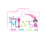 Submission #94 By zank (A.T.)
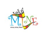 Submission #34 By Iconic Designs
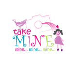 Submission #96 By zank (A.T.)
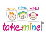 Submission #138 By sweethuhknee
 Submission #77 By Falconstar
 Submission #78 By Iconic Designs
 Submission #110 By radimitrova
 Submission #139 By sweethuhknee
 Submission #2 By Iconic Designs
 Submission #3 By Iconic Designs
 Submission #79 By sweethuhknee
 Submission #80 By sweethuhknee
 Submission #41 By Iconic Designs
 Submission #114 By Falconstar
 Submission #6 By Falconstar
 Submission #7 By Falconstar
 Submission #81 By elfalab
 Submission #140 By sweethuhknee
 Submission #182 By Falconstar
 Submission #115 By sweethuhknee
 Submission #183 By Falconstar
 Submission #84 By sweethuhknee
 Submission #45 By sweethuhknee
 Submission #85 By sweethuhknee
 Submission #116 By sweethuhknee
 Submission #117 By sweethuhknee
 Submission #174 By whitecat (A.T.)
 Submission #46 By Falconstar
 Submission #175 By whitecat (A.T.)
 Submission #176 By whitecat (A.T.)
 Submission #177 By whitecat (A.T.)
 Submission #86 By sweethuhknee
 Submission #148 By sweethuhknee
 Submission #149 By sweethuhknee
 Submission #150 By sweethuhknee
 Submission #118 By sweethuhknee
 Submission #181 By Falconstar
 Submission #151 By Falconstar
 Submission #153 By sweethuhknee
 Submission #154 By Falconstar
 Submission #119 By Falconstar
 Submission #51 By Falconstar
 Submission #155 By sweethuhknee
 Submission #13 By Falconstar
 Submission #120 By Falconstar
 Submission #156 By sweethuhknee
 Submission #157 By sweethuhknee
 Submission #158 By sweethuhknee
 Submission #15 By Falconstar
 Submission #53 By zedlexis
 Submission #54 By zedlexis
 Submission #55 By zedlexis
 Submission #144 By zedlexis
 Submission #124 By Falconstar
 Submission #125 By elfalab
 Submission #90 By zedlexis
 Submission #127 By zank (A.T.)
 Submission #91 By zedlexis
 Submission #160 By sweethuhknee
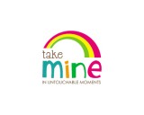 Submission #20 By leev
 Submission #128 By zank (A.T.)
 Submission #161 By sweethuhknee
 Submission #129 By zank (A.T.)
 Submission #22 By leev
 Submission #130 By zank (A.T.)
 Submission #131 By zank (A.T.)
 Submission #23 By HALO
 Submission #162 By Falconstar
 Submission #61 By Falconstar
 Submission #167 By leev
 Submission #168 By leev
 Submission #169 By leev
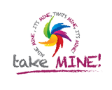
 Submission #65 By artespraticas (A.T.)


 Secure