 (800) 995 - 6177
 )
)  )
)


-
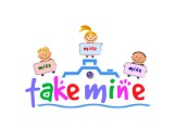
Client Rank: # 1
 Submission #180
By Falconstar -
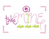
Client Rank: # 2
 Submission #166
By sweethuhknee -
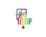
Client Rank: # 3
 Submission #147
By sweethuhknee -
Client Rank: # 6
 Submission #165
By Falconstar -
Client Rank: # Not Ranked
 Submission #170
By crystaldesizns (A.T.) -
Client Rank: # Not Ranked
 Submission #171
By crystaldesizns (A.T.) -
Client Rank: # Not Ranked
 Submission #132
By sach (A.T.) -
Client Rank: # Not Ranked
 Submission #133
By sach (A.T.) -
Client Rank: # Not Ranked
 Submission #134
By sach (A.T.) -
Client Rank: # Not Ranked
 Submission #135
By sach (A.T.) -
Client Rank: # Not Ranked
 Submission #136
By sach (A.T.) -
Client Rank: # Not Ranked
 Submission #137
By sach (A.T.) -
Client Rank: # Not Ranked
 Submission #29
By magicalmysterycat -
Client Rank: # Not Ranked
 Submission #30
By magicalmysterycat -
Client Rank: # Not Ranked
 Submission #31
By magicalmysterycat -
Client Rank: # Not Ranked
 Submission #72
By Rick (A.T.) -
Client Rank: # Not Ranked
 Submission #95
By zank (A.T.) -
Client Rank: # Not Ranked
 Submission #35
By Pakderisher (A.T.) -
Client Rank: # Not Ranked
 Submission #97
By radimitrova -
Client Rank: # Not Ranked
 Submission #145
By crystaldesizns (A.T.) -
Client Rank: # Not Ranked
 Submission #98
By radimitrova -
Client Rank: # Not Ranked
 Submission #99
By radimitrova -
Client Rank: # Not Ranked
 Submission #100
By radimitrova -
Client Rank: # Not Ranked
 Submission #101
By radimitrova -
Client Rank: # Not Ranked
 Submission #103
By radimitrova -
Client Rank: # Not Ranked
 Submission #104
By radimitrova -
Client Rank: # Not Ranked
 Submission #105
By radimitrova -
Client Rank: # Not Ranked
 Submission #106
By radimitrova -
Client Rank: # Not Ranked
 Submission #107
By radimitrova -
Client Rank: # Not Ranked
 Submission #146
By crystaldesizns (A.T.) -
Client Rank: # Not Ranked
 Submission #36
By khisnuroni -
Client Rank: # Not Ranked
 Submission #108
By radimitrova -
Client Rank: # Not Ranked
 Submission #109
By radimitrova -
Client Rank: # Not Ranked
 Submission #37
By crystaldesizns (A.T.) -
Client Rank: # Not Ranked
 Submission #111
By radimitrova -
Client Rank: # Not Ranked
 Submission #1
By plsohani -
Client Rank: # Not Ranked
 Submission #38
By crystaldesizns (A.T.) -
Client Rank: # Not Ranked
 Submission #112
By radimitrova -
Client Rank: # Not Ranked
 Submission #113
By radimitrova -
Client Rank: # Not Ranked
 Submission #4
By khisnuroni -
Client Rank: # Not Ranked
 Submission #39
By crystaldesizns (A.T.) -
Client Rank: # Not Ranked
 Submission #5
By sureshkumar (A.T.) -
Client Rank: # Not Ranked
 Submission #42
By radimitrova -
Client Rank: # Not Ranked
 Submission #43
By radimitrova -
Client Rank: # Not Ranked
 Submission #44
By radimitrova -
Client Rank: # Not Ranked
 Submission #82
By elfalab -
Client Rank: # Not Ranked
 Submission #83
By elfalab -
Client Rank: # Not Ranked
 Submission #10
By magicalmysterycat -
Client Rank: # Not Ranked
 Submission #11
By magicalmysterycat -
Client Rank: # Not Ranked
 Submission #12
By jenniferlander (A.T.) -
Client Rank: # Not Ranked
 Submission #178
By crystaldesizns (A.T.) -
Client Rank: # Not Ranked
 Submission #47
By jenniferlander (A.T.) -
Client Rank: # Not Ranked
 Submission #179
By elfalab -
Client Rank: # Not Ranked
 Submission #49
By logoman (A.T.) -
Client Rank: # Not Ranked
 Submission #152
By crystaldesizns (A.T.) -
Client Rank: # Not Ranked
 Submission #50
By crystaldesizns (A.T.) -
Client Rank: # Not Ranked
 Submission #141
By radimitrova -
Client Rank: # Not Ranked
 Submission #142
By radimitrova -
Client Rank: # Not Ranked
 Submission #121
By sureshkumar (A.T.) -
Client Rank: # Not Ranked
 Submission #122
By sureshkumar (A.T.) -
Client Rank: # Not Ranked
 Submission #123
By sureshkumar (A.T.) -
Client Rank: # Not Ranked
 Submission #52
By sureshkumar (A.T.) -
Client Rank: # Not Ranked
 Submission #56
By crystaldesizns (A.T.) -
Client Rank: # Not Ranked
 Submission #57
By khisnuroni -
Client Rank: # Not Ranked
 Submission #58
By khisnuroni -
Client Rank: # Not Ranked
 Submission #16
By Tdesign -
Client Rank: # Not Ranked
 Submission #59
By crystaldesizns (A.T.) -
Client Rank: # Not Ranked
 Submission #87
By sureshkumar (A.T.) -
Client Rank: # Not Ranked
 Submission #17
By sureshkumar (A.T.) -
Client Rank: # Not Ranked
 Submission #88
By sureshkumar (A.T.) -
Client Rank: # Not Ranked
 Submission #89
By sureshkumar (A.T.) -
Client Rank: # Not Ranked
 Submission #159
By sureshkumar (A.T.) -
Client Rank: # Not Ranked
 Submission #126
By elfalab -
Client Rank: # Not Ranked
 Submission #18
By sketch -
Client Rank: # Not Ranked
 Submission #19
By sketch -
Client Rank: # Not Ranked
 Submission #60
By Tdesign -
Client Rank: # Not Ranked
 Submission #163
By crystaldesizns (A.T.) -
Client Rank: # Not Ranked
 Submission #164
By crystaldesizns (A.T.) -
Client Rank: # Eliminated
-
Client Rank: # Eliminated
-
Client Rank: # Eliminated
-
Client Rank: # Eliminated
-
Client Rank: # Eliminated
-
Client Rank: # Eliminated
-
Client Rank: # Eliminated
-
Client Rank: # Eliminated
-
Client Rank: # Eliminated


 munirahijazi
 United Arab Emirates
 Secure