 paideia community
 France
Buyer
Joined: May 17, 2020
Posted On: May 24, 2020
Hi all,
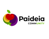
After sharing with friends and thinking a lot, I will go for a proposal of Blvck. I am sorry for all of you that invested time for no rewards.
Thank you very much for all your proposals.
All the best,
JP
paideia community
France
Buyer
Joined: May 17, 2020
Posted On: May 23, 2020
Hi all,
I feel we have had many ideas and variations already, so I will end the contest tonight. I will come back to you tomorrow with my final decision.
Many thanks for your engagement and the time you have spent on this. You've really helped me to define what I was looking for.
JP
paideia community
France
Buyer
Joined: May 17, 2020
Posted On: May 23, 2020
Hi all,
Submission #213 and #214: I like the idea of a less regular font. Ultimately, Paideia will be gathering people that do a manual activity, working in the earth. So the logo could be a bit "dirty". Very often, the logo of organic or natural products is made with fonts a bit more drawn.
JP
paideia community
France
Buyer
Joined: May 17, 2020
Posted On: May 22, 2020
Hi all,
Looking at your ideas and proposals, I saw on the internet that the green bean plant is quite twisty and nice ... it could well make the P letter of Paideia for example (or another). I have done a drawing that maybe could inspire you in new directions.
Any questions, please feel free to ask.
JP
paideia community
France
Buyer
Joined: May 17, 2020
Posted On: May 22, 2020
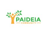
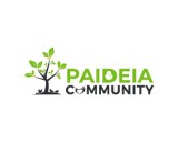
Hi All,
I really like the idea of the tree, so please do not discard it. However, I would be interested in seeing more vegetables like tomatoes, carrots, etc ... so i have made a quick drawing. It is a bit distorted sorry. Hope this will give some ideas.
JP
paideia community
France
Buyer
Joined: May 17, 2020
Posted On: May 22, 2020
Hi all,
Submission #55: I cannot really see the purpose of the association in the logo.
Submission #58: The logo shows predominantly a fish, so it is a bit restrictive i believe
Submission #89, #90 and #106: I like the idea that the logo cover a large scope of the purpose of the association, however I am not so keen on the overall shape
Submission #91: I like the colour and shape but cannot find the purpose of the association in the logo
Submissions #94 to #105: I really like the idea of the person spreading the leaves, although there is no clear reference to food production
JP
paideia community
France
Buyer
Joined: May 17, 2020
Posted On: May 21, 2020
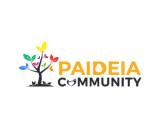
Submission #39, #40, #41 and #42: I really like the characters that represent the community. What is less clear is the food production (maybe there could be fruits on the tree, or maybe a plant (like a tomato / pepper or whatever )
paideia community
France
Buyer
Joined: May 17, 2020
Posted On: May 21, 2020
Hi all,
Let me give you a bit more previsions.
Paideia is made for individuals that will grow their own food, so in terms of vegetables, we are talking probably about salads, tomatoes, egglant (the color could be nice !), peppers, cucumbers or all kind of fruits (for example, wheat is unlikely on such small scale)
Regarding the animal production, we would be talking about fishes (trouts, carps, ...) or small animals (mostly chickens to get a bit of meat or eggs)
Submission #34, #35 or #56: I would prefer to see a clear reference to the production of food (either vegetables or small animals).
Submissions #43 to #48: the fish is a dolphin, so not one you could grow. Could be good trying to replace it by a trout, as I like the idea.
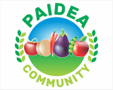
Submissions #49 to #52: I like to logo that shows the community and the vegetables, as well as showing nice colours with contrast.
Will make more comments this evening,
JP
paideia community
France
Buyer
Joined: May 17, 2020
Posted On: May 20, 2020
Hi all,
Submission 19: I like the symbol, it feel it lack a little bit of contrast.
Submission 20: I feel it looks like a celtic or religious symbol. I don't see so clearly the notion of community or food production
Submission 22 to 23: I like the symbol and colors
Submission 25: I see a butterfly, more than a leaf.
Submission 26 and 27: I like the symbol.
Submission 30: I like the idea of bringing some other colours
Submission 31: I am not sure about the logo ... the bulb is too defined and I feel it could be the logo of an energy company
Paideia will be covering not only production of vegetables, but also fishes or chickens for example. I think interesting things could be done with shapes of fishes. I would be interested to see logo that could give the idea of a wider range of production, or even the idea of micro farms.
Please feel free to message me if you have questions and i will answer.
JP
paideia community
France
Buyer
Joined: May 17, 2020
Posted On: May 19, 2020
Hi all,
Thanks for all your ideas and submissions. Let me put a few comments to guide you a bit more.
On submission 1, I am not too sure about the apple / wheat design.
On submission 2 and 3, I believe the logo in the middle is difficult to recognise (particularly if the logo is small), however I like the idea of using more than 2 colours.
On submission 3 and 7, I like the drawing that can either be seen as a plant or a person.
On submission 9, I like the colours, however I feel that the characters look more like children.
On submission 14 and 15, I like the lines round and smooth.
On submission 16, the logo looks a little bit like a candle, however the composition is nice.
On submission 18, I am not sure about the black and red colours together.
Hope this helps,
JP
Admin
Posted On: May 17, 2020
Welcome and Thank You for Choosing LogoContest.com!
Here are some helpful hints to make sure you get the most out of our site, and your contest.
DO NOT FINALIZE YOUR CONTEST UNTIL ALL REVISIONS ARE MADE AND THE EXACT DESIGN YOU WANT IS SHOWING AND RANKED #1.
1. Please rank your submissions or post general comments a minimum of 1 time per day while your contest is running. This is required should you want to request an extension to your contest and will produce the best results from our designers.
2. Once your contest receives 40 design concepts, your prize amount will become "Guaranteed".
3. Please make the most out of our messaging and comment systems.
a) Place general comments on this main contest page to give all of the designers your preferences and what you would like to see or not see.
b) Clicking on any designers submssion will bring up a page of all submissions by that designer with an option to post private comments pertaining only to his work. (Only the contest Holder and that designer can view and post to this page)
c) Clicking on the designer username under a submission will allow you to send a completely private message to that specific designer.
4. Please "Eliminate" only those logo designs that you feel have no chance of winning your contest. (Be aware that eliminating everything may discourage participation from the designers.)
5. Please rank the designs 1 to 10 and there are also options to rank Elements you like, Colors you like, and Fonts you like. This will help guide the designers toward the design that you are looking for. For the best variety of designs, try not to keep the same design ranked #1 for an extended time as this may result in copying of that design.
6. We require that you do not ask one Designer to use elements or concepts from another Designer. The general rule is that, if a Designer was the first to use and submit the idea in one of their designs, they essentially own that concept or idea for the remainder of the contest. We will remove any deisgns that use copied concepts. Requests or ideas you have put in your Contest Brief or posted as contest attachments are fair game and open to everyone. Concepts that are considered obvious will also be fair game, for example: a dog & cat for a pet hospital, shopping bag for an e-commerce company, a tooth for a dentist, initials for a lawyer, etc.
7. Once your contest ends and is in judging mode, any designer that is ranked #1 #2 #3 #4 or #5 will be able to upload any revisions you request. Simply rank a designers entry to allow revisions to be uploaded.
Discussion Guidelines:
1. Designers and Contest Holders please always be respectful of each other, we all have the same goal.
2. Please do not criticize any design publicly, these discussions should only be held in private.
3. Designers may not post any external links to any designs.
4. Please do not ask a contest holder to view your designs or discuss any other designs.
5. Designers can not discuss copied designs on the contest pages and may submit a Logo Dispute to the Admin only.
Our team at LogoContest.com as well as our designers will make sure you are 100% satisfied and want you to leave here with a design that you love!
Please recommend us to your friends and business associates for all of their logo design and web page design needs.
 (800) 995 - 6177


 Submission #30 By artcover
 Submission #265 By ivan silva
 Submission #266 By ivan silva
 Submission #267 By ivan silva
 Submission #246 By prince
 Submission #268 By ivan silva
 Submission #269 By ivan silva
 Submission #270 By ivan silva
 Submission #247 By prince
 Submission #271 By ivan silva
 Submission #248 By prince
 Submission #272 By ivan silva
 Submission #261 By Getzcrutz
 Submission #273 By ivan silva
 Submission #274 By ivan silva
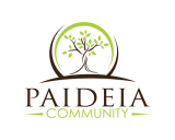 Submission #249 By prince
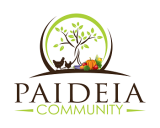 Submission #250 By prince
 Submission #53 By artcover
 Submission #83 By MSD MOOVENDHAN
 Submission #251 By prince
 Submission #84 By MSD MOOVENDHAN
 Submission #85 By MSD MOOVENDHAN
 Submission #86 By MSD MOOVENDHAN
 Submission #87 By MSD MOOVENDHAN
 Submission #88 By MSD MOOVENDHAN
 Submission #262 By WhiteLogos
 Submission #263 By WhiteLogos
 Submission #264 By WhiteLogos
 Submission #54 By artcover
 Submission #197 By artcover
 Submission #92 By CrisPen
 Submission #28 By artcover
 Submission #29 By artcover
 Submission #21 By agus57septian67
 Submission #208 By hologram
 Submission #212 By hologram
 Submission #61 By MSD MOOVENDHAN
 Submission #66 By MSD MOOVENDHAN
 Submission #244 By artcover
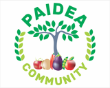 Submission #227 By hologram
 Submission #10 By doswave
 Submission #11 By doswave
 Submission #36 By artcover
 Submission #37 By artcover
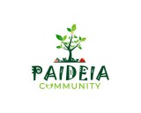 Submission #233 By blvck
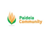 Submission #38 By artcover
 Submission #234 By blvck
 Submission #235 By Firda
 Submission #163 By urudsign


 Secure