 rncost
 United States
Buyer
Joined: Mar 15, 2012
Posted On: Mar 29, 2012
My wife and I are still reviewing all of your final entries. These is several really nice designs so this is going to be a tough choice! Will be making decision by the end of the weekend.
Thanks!
rncost
United States
Buyer
Joined: Mar 15, 2012
Posted On: Mar 25, 2012
Anupam, in design #106 can you make the tooth people the D1C5A4 color from that website that I posted:
http://www.colorschemer.com/schemes/index.php?start=0&tag=calm
Also in design #105 can you make the tooth in the center of that design the same color? I want to compare it to the design you've already done with the white background. Best of luck!
rncost
United States
Buyer
Joined: Mar 15, 2012
Posted On: Mar 25, 2012
Dezinden, I like the alternative design ideas that you've offered! Can you re-do the color scheme to match the color swatches that I indicated from the website I commented about yesterday?
Thanks!
rncost
United States
Buyer
Joined: Mar 15, 2012
Posted On: Mar 24, 2012
P.S. I'm not liking the combination of the blue and the red, so lets remove that color combination.
rncost
United States
Buyer
Joined: Mar 15, 2012
Posted On: Mar 24, 2012
Ok, I definitely have some favorite designs and I will be listing those in the next few hours. Since this logo is for a dental office I want the color combinations to be calming but I want there to be an element that attracts the prospective patients eye to our logo/sign. Go to the following website:
http://www.colorschemer.com/schemes/index.php?start=0&tag=calm
And go down to the color scheme "Spring Morning". I want the following 3 colors #D1C5A4, #665D51, #8E9C6D used as the main colors of the logo. I would also like #CB694D used as an accent color that will draw the clients eye to the logo.
1 day to go--looking forward to some big time creativity down the home stretch!
rncost
United States
Buyer
Joined: Mar 15, 2012
Posted On: Mar 21, 2012
Alright, well this is just fun. Ya'll have a lot of creative talent! Iconic Designs, I like that you went out on the limb and changed the color scheme of your logo. I really like that combo. of blue and dark tan/brown. The tooth logo is too plain, I want something more artistic there though. Design #63 is appealing but again I feel too plain, but again I really like the font layout! My top two at this time with 4.5 days to go is design #47 and #49. Can someone throw a design out there with the red color in the University of South Carolina Gamecocks logo. We still have 4 days on this contest--lets increase the creativity. I encourage ya'll to think outside of the box!
rncost
United States
Buyer
Joined: Mar 15, 2012
Posted On: Mar 19, 2012
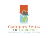
Ok everyone, thanks for all of your submissions! We're getting there. Elements I like: Design #4 and #46: I like how the text is laid out on the right in bold with the icon on the left with the line separating the two. As far as layout goes I also like the bold font of design #34-37. Although the phrase "Changing Lives One Smile at a Time" should be in all Caps like in design #40. I love the font and layout (spacing of letters in design #40, although I like the font color scheme of design #34-37 better). Also I think I've decided that we either need to stick to the smile/tooth/family style logo like in design #12, 28, 40-42 or the incorporation of the palmetto logo like in design #3 and 13. Designs that combine the two like designs #33-35 and 43 are just TOO busy. I think the prospective patient will lose the message. Also design #39, 40 are too abstract. I want a patient to know that if they only see the pictoral mark of the logo that this is a dental office. I like the tooth drawing in designs #17 and #37. The smile in design #46 is too cartoonish for my taste. I want an image of a smile that is artistic, modern, and simple. Keep up the good work everyone! Thanks again!
rncost
United States
Buyer
Joined: Mar 15, 2012
Posted On: Mar 17, 2012
Anupam, I like what you've created. Any way in your design you could incorporate a tooth or something related to dentistry. Again I want prospective patients to be able to see the pictoral mark only (if I take away any of the text in your logo) and still be able to understand that this is the icon of a dental office. Also I don't like the upside down half moon shape on the left side of the icon. I don't really understand that element of your logo. I still see no submissions that pop out at me and say "Wow, thats my logo!" But ya'll are movin' in the right direction!
rncost
United States
Buyer
Joined: Mar 15, 2012
Posted On: Mar 16, 2012
Iconic designs, I like the color choices in the logo. I'm not quite sure what those white talon looking nuances are in the green part of the logo. Also I feel like the overall feel of the logo is too abstract. I want something that's modern, but not so modern and abstract that it doesn't speak to my patient base (I practice in a more rural area). When you're trying to come up with color and font designs think of what you might see in a chic version Southern Living magazine.
rncost
United States
Buyer
Joined: Mar 15, 2012
Posted On: Mar 16, 2012
Maxim, I like your overall design. I'm not crazy about the placement of the moon. I want to try and maintain the palmetto logo so it is recognizable. But I like the idea of the palm in the logo. I also like having the text underneath the logo. But I want the logo to be complex enough so that if I wanted to remove the text and have more of a pictoral mark, I would be able to do that and still maintain my brand recognition. I like the initial idea, but when I look at your design, I don't get the feeling, "WOW, that's it--I have to have that logo!"
Admin
Posted On: Mar 15, 2012
Welcome and Thank You for Choosing LogoContest.com!
Here are some helpful hints to make sure you get the most out of our site, and your contest.
1. Please rank your submissions or post general comments a minimum of 1 time per day while your contest is running. This is required should you want to request an extension to your contest and will produce the best results from our designers.
2. Once your contest receives 40 design concepts, your prize amount will become "Guaranteed".
3. Please make the most out of our messaging and comment systems.
a) Place general comments on this main contest page to give all of the designers your preferences and what you would like to see or not see.
b) Clicking on any designers submssion will bring up a page of all submissions by that designer with an option to post private comments pertaining only to his work. (Only the contest Holder and that designer can view and post to this page)
c) Clicking on the designer username under a submission will allow you to send a completely private message to that specific designer.
4. Please "Eliminate" only those logo designs that you feel have no chance of winning your contest. (Be aware that eliminating everything may discourage participation from the designers.)
5. Please rank the designs 1 to 10 and there are also options to rank Elements you like, Colors you like, and Fonts you like. This will help guide the designers toward the design that you are looking for. For the best variety of designs, try not to keep the same design ranked #1 for an extended time as this may result in copying of that design.
6. Once your contest ends and is in judging mode, any revisions to designs that you request from the designers can be emailed to support AT(@) logocontest.com and we will enter them into your contest for you.
Discussion Guidelines:
1. Designers and Contest Holders please always be respectful of each other, we all have the same goal.
2. Please do not criticize any design publicly, these discussions should only be held in private.
3. Designers may not post any external links to any designs.
4. Please do not ask a contest holder to view your designs or discuss any other designs.
5. Designers can not discuss copied designs on the contest pages and may submit a Logo Dispute to the Admin only.
Our team at LogoContest.com as well as our designers will make sure you are 100% satisfied and want you to leave here with a design that you love!
Please recommend us to your friends and business associates for all of their logo design and web page design needs.
 (800) 995 - 6177


 Submission #113 By Iconic Designs
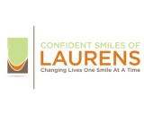 Submission #4 By Iconic Designs
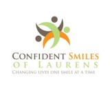 Submission #40 By artespraticas (A.T.)
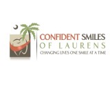 Submission #114 By smilysb
 Submission #115 By smilysb
 Submission #116 By smilysb
 Submission #117 By smilysb
 Submission #118 By smilysb
 Submission #119 By smilysb
 Submission #120 By smilysb
 Submission #121 By smilysb
 Submission #122 By smilysb
 Submission #127 By lokereheri
 Submission #128 By AnthonyG
 Submission #18 By smilysb
 Submission #75 By smilysb
 Submission #62 By artespraticas (A.T.)

 Secure