 DanielPierre
 Switzerland
Buyer
Joined: Feb 12, 2015
Posted On: Feb 19, 2015
Dear design community
thank you for the unique designs.
I ranked 10 designs I like the best, without saying that 1 is the best.
I struggle a bit with Colors to work well on white paper.
I will ask some friends for their opinion and make my final choice soon.
It was agreat experience an I hope you hade some fun to work on this logo.
Kind regards
DanielPierre
Switzerland
Buyer
Joined: Feb 12, 2015
Posted On: Feb 17, 2015
Dear Design Community
sorry made some classification and forgot to post my comments yesterday.
Thank you for your new entries. I reaized that some used small letters instead of capital letters. Also some of my comments seem to have been considered.
Here my comments/remarks:
- I marked "elements I like" to the typology I like, even though I have not seen THE one yet.
- I like the versions with small letters, but still prefer to have capital letters in the logo, just to have it close to how the legal name of the company.
- There can be an icon incorporated in the logo, which I could then use in corporate documents, i.e. for PPT etc. This icon however, shall not be too dominant and preferably have a geometric form.
- the logo shall work with and without the add on Management & Consultancy Services.
- I come to the conclusion that the logo shall be used on white or light grey background, so I do not need to use a coloured frame.
I hope these comments help a bit.
Kind regards, DP
DanielPierre
Switzerland
Buyer
Joined: Feb 12, 2015
Posted On: Feb 14, 2015
as an example, there is a logo I like http://www.exent.ch
modern, easy to read, just a few modifications to the typlology
DanielPierre
Switzerland
Buyer
Joined: Feb 12, 2015
Posted On: Feb 14, 2015
Dear design community
thank you for your entries. Here my comments:
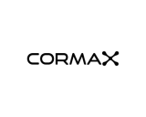
-CORMAX is the logo, no seperate add ons necessary like CX or C3
-If two colours, they should be equal strong, to avoid having two names, or one letter disappearing because
- work on typology, using european type, modern, pure
- Background could also stay White
I hope this provides some guidance
cheers, DP
DanielPierre
Switzerland
Buyer
Joined: Feb 12, 2015
Posted On: Feb 13, 2015
Dear design-community
thank you for the first shots.
Here my general comments to provide guidance:
-working with the letter C or X is ok, but simple not to kittenish/playful
-Fonts best probably black, grey or white, modern, easy to read
-Background maybe green, grey or blue
remark:
-CORMAX is phantasy name, composed from COR (First three letters of my name), MA (Management) X (Services)
This is just for info and does not represent a guideline
Admin
Posted On: Feb 12, 2015
Welcome and Thank You for Choosing LogoContest.com!
Here are some helpful hints to make sure you get the most out of our site, and your contest.
DO NOT FINALIZE YOUR CONTEST UNTIL ALL REVISIONS ARE MADE AND THE EXACT DESIGN YOU WANT IS SHOWING AND SELECTED.
1. Please rank your submissions or post general comments a minimum of 1 time per day while your contest is running. This is required should you want to request an extension to your contest and will produce the best results from our designers.
2. Once your contest receives 40 design concepts, your prize amount will become "Guaranteed".
3. Please make the most out of our messaging and comment systems.
a) Place general comments on this main contest page to give all of the designers your preferences and what you would like to see or not see.
b) Clicking on any designers submssion will bring up a page of all submissions by that designer with an option to post private comments pertaining only to his work. (Only the contest Holder and that designer can view and post to this page)
c) Clicking on the designer username under a submission will allow you to send a completely private message to that specific designer.
4. Please "Eliminate" only those logo designs that you feel have no chance of winning your contest. (Be aware that eliminating everything may discourage participation from the designers.)
5. Please rank the designs 1 to 10 and there are also options to rank Elements you like, Colors you like, and Fonts you like. This will help guide the designers toward the design that you are looking for. For the best variety of designs, try not to keep the same design ranked #1 for an extended time as this may result in copying of that design.
6. We require that you do not ask one Designer to use elements or concepts from another Designer. The general rule is that, if a Designer was the first to use and submit the idea in one of their designs, they essentially own that concept or idea for the remainder of the contest. We will remove any deisgns that use copied concepts. Requests or ideas you have put in your Contest Brief or posted as contest attachments are fair game and open to everyone. Concepts that are considered obvious will also be fair game, for example: a dog & cat for a pet hospital, shopping bag for an e-commerce company, a tooth for a dentist, initials for a lawyer, etc.
7. Once your contest ends and is in judging mode, any designer that is ranked #1 #2 #3 #4 or #5 will be able to upload any revisions you request. Simply rank a designers entry to allow revisions to be uploaded.
Discussion Guidelines:
1. Designers and Contest Holders please always be respectful of each other, we all have the same goal.
2. Please do not criticize any design publicly, these discussions should only be held in private.
3. Designers may not post any external links to any designs.
4. Please do not ask a contest holder to view your designs or discuss any other designs.
5. Designers can not discuss copied designs on the contest pages and may submit a Logo Dispute to the Admin only.
Our team at LogoContest.com as well as our designers will make sure you are 100% satisfied and want you to leave here with a design that you love!
Please recommend us to your friends and business associates for all of their logo design and web page design needs.
 (800) 995 - 6177


 Submission #141 By alpino
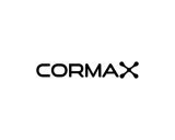 Submission #147 By alpino
 Submission #88 By VhienceFX
 Submission #144 By VhienceFX
 Submission #86 By alpino
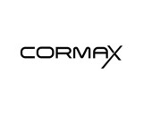 Submission #89 By CrisPen
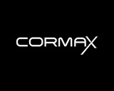 Submission #90 By CrisPen
 Submission #17 By Venom
 Submission #27 By Venom
 Submission #140 By alpino
 Submission #142 By VhienceFX
 Submission #35 By alpino
 Submission #119 By alpino
 Submission #45 By CrisPen
 Submission #48 By CrisPen
 Submission #49 By CrisPen
 Submission #145 By VhienceFX
 Submission #71 By Venom
 Submission #83 By illkatchye
 Submission #84 By illkatchye
 Submission #87 By VhienceFX
 Submission #92 By mshblajar
 Submission #13 By rxzor
 Submission #93 By Kalipso
 Submission #94 By mshblajar
 Submission #95 By mshblajar
 Submission #96 By Venom
 Submission #98 By Kalipso
 Submission #99 By FLASH
 Submission #100 By FLASH
 Submission #101 By FLASH
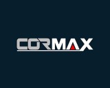 Submission #22 By CrisPen
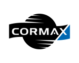 Submission #103 By mshblajar
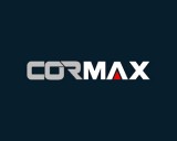 Submission #23 By CrisPen
 Submission #24 By Venom
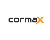 Submission #25 By Venom
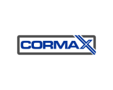 Submission #115 By JeanN
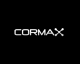 Submission #138 By alpino
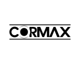 Submission #116 By JeanN
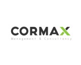 Submission #28 By Venom
 Submission #29 By Venom
 Submission #30 By Venom
 Submission #31 By Venom
 Submission #32 By FLASH
 Submission #143 By VhienceFX
 Submission #118 By JeanN
 Submission #39 By zedlexis
 Submission #41 By illkatchye
 Submission #42 By illkatchye
 Submission #44 By illkatchye
 Submission #120 By alpino
 Submission #121 By alpino
 Submission #122 By alpino
 Submission #123 By Venom
 Submission #124 By Venom
 Submission #125 By Venom
 Submission #126 By Venom
 Submission #127 By Venom
 Submission #128 By Venom
 Submission #52 By Iconic Designs
 Submission #129 By rxzor
 Submission #53 By Iconic Designs
 Submission #130 By Iconic Designs
 Submission #54 By Iconic Designs
 Submission #131 By Iconic Designs
 Submission #132 By Firman
 Submission #133 By zedlexis
 Submission #134 By Venom
 Submission #135 By zedlexis
 Submission #136 By zedlexis
 Submission #137 By zedlexis
 Submission #55 By reza_wawan
 Submission #1 By illkatchye
 Submission #2 By illkatchye
 Submission #4 By illkatchye
 Submission #148 By VhienceFX
 Submission #149 By VhienceFX
 Submission #150 By VhienceFX
 Submission #67 By my twist
 Submission #68 By my twist
 Submission #69 By fransisca
 Submission #70 By Venom
 Submission #72 By Venom
 Submission #73 By Venom
 Submission #74 By Venom
 Submission #75 By Venom
 Submission #151 By VhienceFX
 Submission #76 By Venom
 Submission #152 By VhienceFX
 Submission #77 By Venom
 Submission #78 By Venom
 Submission #79 By Venom
 Submission #80 By Venom
 Submission #81 By Venom
 Submission #82 By Venom
 Submission #85 By alpino


 Secure