 lwatt
lwatt
 United States
Buyer
Joined: Apr 23, 2014
Posted On: May 12, 2014
Submission #59 & 60 - Like the lettering and the map. The design needs something to make it pop - maybe more color. Suggest adding emphasis on the meaning of STEM.
lwatt
United States
Buyer
Joined: Apr 23, 2014
Posted On: May 11, 2014
Submission #52 & 53 - we would like to see all 9 counties in this map outlined with a line black line. I have attached a map of the nine counties.
lwatt
United States
Buyer
Joined: Apr 23, 2014
Posted On: May 10, 2014
Submission 23 & 45 - make font bigger to square with side of STEM map. Outline STEM map with a line black line.
Submission 36 - make font larger & STEM symbols larger.
Submission 48 - like as is
lwatt
United States
Buyer
Joined: Apr 23, 2014
Posted On: May 09, 2014
To all designers we have decided not to use the county names (Modoc, Siskiyou, Lassen, Shasta, Trinity, Tehama, Plumas, Glenn & Butte)
lwatt
United States
Buyer
Joined: Apr 23, 2014
Posted On: May 09, 2014
Submission #19 like the design and colors however the graphics in each square appear to be cut off, suggest making the graphics smaller.
Submission #33 Would like to see the word STEM larger and differ color
Submission # 27- like the design would like to see the size of the font for North State smaller and the font for STEM larger.
Submission #43 - like the design but would like to see in a cleaner font.
lwatt
United States
Buyer
Joined: Apr 23, 2014
Posted On: May 08, 2014
We like the look of #15 however, we prefer the four shadow circles best on submission #18. Can you make the white stand out more in the green circle? Also, STEM is the focal point of the logo so we would like to see a decrease in font for North State and an increase in font for S-T-E-M. We also like the map in the "O" on submission #15 and are aware if you decrease the font there won't be room for the map. We would like to keep the map somewhere within the logo. Can you do a submission with the four circles stacked on the side? We aslo would like to see a couple of designs with different fonts.
lwatt
United States
Buyer
Joined: Apr 23, 2014
Posted On: May 07, 2014
Submission #1
Like the clean lines and suggest adding reference to the nine counties by a map or the shape of the nine county region, which would define the "North State" lettering.
Also, would like some kind of reference to community, students, business/industry, STEM (Science, Technology, Engineering, Math)
lwatt
United States
Buyer
Joined: Apr 23, 2014
Posted On: May 06, 2014
Colors need to be bolder, no correlation to what STEM stands for (designers need to look up on the web what STEM stands for ((Science, Technology, Engineering Math.)) No connection to community, business/industry or students.
Admin
Posted On: May 05, 2014
Welcome and Thank You for Choosing LogoContest.com!
Here are some helpful hints to make sure you get the most out of our site, and your contest.
DO NOT FINALIZE YOUR CONTEST UNTIL ALL REVISIONS ARE MADE AND THE EXACT DESIGN YOU WANT IS SHOWING AND SELECTED.
1. Please rank your submissions or post general comments a minimum of 1 time per day while your contest is running. This is required should you want to request an extension to your contest and will produce the best results from our designers.
2. Once your contest receives 40 design concepts, your prize amount will become "Guaranteed".
3. Please make the most out of our messaging and comment systems.
a) Place general comments on this main contest page to give all of the designers your preferences and what you would like to see or not see.
b) Clicking on any designers submssion will bring up a page of all submissions by that designer with an option to post private comments pertaining only to his work. (Only the contest Holder and that designer can view and post to this page)
c) Clicking on the designer username under a submission will allow you to send a completely private message to that specific designer.
4. Please "Eliminate" only those logo designs that you feel have no chance of winning your contest. (Be aware that eliminating everything may discourage participation from the designers.)
5. Please rank the designs 1 to 10 and there are also options to rank Elements you like, Colors you like, and Fonts you like. This will help guide the designers toward the design that you are looking for. For the best variety of designs, try not to keep the same design ranked #1 for an extended time as this may result in copying of that design.
6. We require that you do not ask one Designer to use elements or concepts from another Designer. The general rule is that, if a Designer was the first to use and submit the idea in one of their designs, they essentially own that concept or idea for the remainder of the contest. We will remove any deisgns that use copied concepts. Requests or ideas you have put in your Contest Brief or posted as contest attachments are fair game and open to everyone. Concepts that are considered obvious will also be fair game, for example: a dog & cat for a pet hospital, shopping bag for an e-commerce company, a tooth for a dentist, initials for a lawyer, etc.
7. Once your contest ends and is in judging mode, any designer that is ranked #1 #2 #3 #4 or #5 will be able to upload any revisions you request. Simply rank a designers entry to allow revisions to be uploaded.
Discussion Guidelines:
1. Designers and Contest Holders please always be respectful of each other, we all have the same goal.
2. Please do not criticize any design publicly, these discussions should only be held in private.
3. Designers may not post any external links to any designs.
4. Please do not ask a contest holder to view your designs or discuss any other designs.
5. Designers can not discuss copied designs on the contest pages and may submit a Logo Dispute to the Admin only.
Our team at LogoContest.com as well as our designers will make sure you are 100% satisfied and want you to leave here with a design that you love!
Please recommend us to your friends and business associates for all of their logo design and web page design needs.
 (800) 995 - 6177


 Submission #61 By sikdesigns (A.T.)
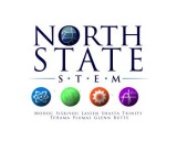 Submission #18 By Tlacaelel
 Submission #19 By sikdesigns (A.T.)
 Submission #23 By sikdesigns (A.T.)
 Submission #24 By sikdesigns (A.T.)
 Submission #25 By sikdesigns (A.T.)
 Submission #53 By sikdesigns (A.T.)
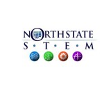 Submission #36 By Tlacaelel
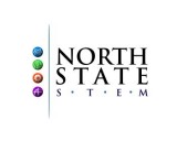 Submission #37 By Tlacaelel
 Submission #43 By sikdesigns (A.T.)
 Submission #45 By sikdesigns (A.T.)
 Submission #49 By sikdesigns (A.T.)
 Submission #50 By sikdesigns (A.T.)
 Submission #59 By CoebaSaja
 Submission #60 By CoebaSaja
 Submission #62 By sikdesigns (A.T.)
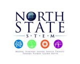 Submission #17 By Tlacaelel
 Submission #51 By sikdesigns (A.T.)
 Submission #20 By sikdesigns (A.T.)
 Submission #21 By sikdesigns (A.T.)
 Submission #22 By sikdesigns (A.T.)
 Submission #26 By Tlacaelel
 Submission #27 By Tlacaelel
 Submission #28 By Tlacaelel
 Submission #29 By Tlacaelel
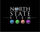 Submission #54 By Tlacaelel
 Submission #30 By Tlacaelel
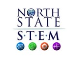 Submission #55 By Tlacaelel
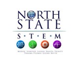 Submission #31 By Tlacaelel
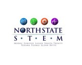 Submission #32 By Tlacaelel
 Submission #57 By Tlacaelel
 Submission #33 By Tlacaelel
 Submission #58 By Tlacaelel
 Submission #34 By Tlacaelel
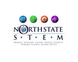 Submission #35 By Tlacaelel
 Submission #38 By Tlacaelel
 Submission #39 By Tlacaelel
 Submission #40 By Tlacaelel
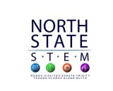 Submission #41 By Tlacaelel
 Submission #42 By Tlacaelel
 Submission #44 By sikdesigns (A.T.)
 Submission #46 By sikdesigns (A.T.)
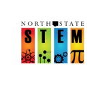 Submission #47 By sikdesigns (A.T.)
 Secure