 PA2014
 Canada
Buyer
Joined: Dec 10, 2013
Posted On: Dec 13, 2013
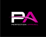
I should note that because of the placement of the p and a in many of the designs, at a first glance it resembles a face, or eyes...this gives too much of a "childish" cartoon feel, which is why some did not grab my attention.
PA2014
Canada
Buyer
Joined: Dec 10, 2013
Posted On: Dec 13, 2013
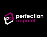
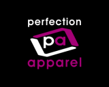
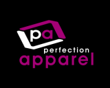
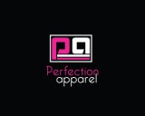
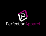
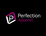
These designs are all great, very well done and there are elements in each that I enjoy, making my decision a difficult one. Please know that I appreciate the time and effort of all, but am starting to narrow down my choices to those designs that really grab my attention and are going to speak the best for my company. I really am loving the black backgrounds with the dark pink, and the use of PA as a symbol, some of the ways the PA is used looks better in some designs than others, I like when they are connected, and when you can distinctly tell what is the P and what is the A.
PA2014
Canada
Buyer
Joined: Dec 10, 2013
Posted On: Dec 11, 2013
This is the first time I have used this site, and I want to say that I really appreciate all of the submissions, alot of talent and they do look great.
I am however, more drawn to some than others, for various reasons.
Of the designs that are really catching my eye here are some reasons:
While those with just the name are nice (#1, 2, 13, 14, 19), I and more drawn to those that are using the PA in a symbolic way, as I feel this could be a great branding tool.
The ones on black background really pop (though there are some design on white that I really love).
I prefer the dark/bright pink over the light/pastel pink.
Some that use the PA as a symbol are too circular (#9) and it looks similar to a pair of glasses.
There are some that appear to have a "shine" (#12 and 8) that I think looks very sharp.
All of these things may not work together in one design but they are elements of the designs I like most that are standing out to me.
Hope this helps and thanks for the submissions!
Admin
Posted On: Dec 10, 2013
Welcome and Thank You for Choosing LogoContest.com!
Here are some helpful hints to make sure you get the most out of our site, and your contest.
DO NOT FINALIZE YOUR CONTEST UNTIL ALL REVISIONS ARE MADE AND THE EXACT DESIGN YOU WANT IS SHOWING AND SELECTED.
1. Please rank your submissions or post general comments a minimum of 1 time per day while your contest is running. This is required should you want to request an extension to your contest and will produce the best results from our designers.
2. Once your contest receives 40 design concepts, your prize amount will become "Guaranteed".
3. Please make the most out of our messaging and comment systems.
a) Place general comments on this main contest page to give all of the designers your preferences and what you would like to see or not see.
b) Clicking on any designers submssion will bring up a page of all submissions by that designer with an option to post private comments pertaining only to his work. (Only the contest Holder and that designer can view and post to this page)
c) Clicking on the designer username under a submission will allow you to send a completely private message to that specific designer.
4. Please "Eliminate" only those logo designs that you feel have no chance of winning your contest. (Be aware that eliminating everything may discourage participation from the designers.)
5. Please rank the designs 1 to 10 and there are also options to rank Elements you like, Colors you like, and Fonts you like. This will help guide the designers toward the design that you are looking for. For the best variety of designs, try not to keep the same design ranked #1 for an extended time as this may result in copying of that design.
6. We require that you do not ask one Designer to use elements or concepts from another Designer. The general rule is that, if a Designer was the first to use and submit the idea in one of their designs, they essentially own that concept or idea for the remainder of the contest. We will remove any deisgns that use copied concepts. Requests or ideas you have put in your Contest Brief or posted as contest attachments are fair game and open to everyone. Concepts that are considered obvious will also be fair game, for example: a dog & cat for a pet hospital, shopping bag for an e-commerce company, a tooth for a dentist, initials for a lawyer, etc.
7. Once your contest ends and is in judging mode, any designer that is ranked #1 #2 #3 #4 or #5 will be able to upload any revisions you request. Simply rank a designers entry to allow revisions to be uploaded.
Discussion Guidelines:
1. Designers and Contest Holders please always be respectful of each other, we all have the same goal.
2. Please do not criticize any design publicly, these discussions should only be held in private.
3. Designers may not post any external links to any designs.
4. Please do not ask a contest holder to view your designs or discuss any other designs.
5. Designers can not discuss copied designs on the contest pages and may submit a Logo Dispute to the Admin only.
Our team at LogoContest.com as well as our designers will make sure you are 100% satisfied and want you to leave here with a design that you love!
Please recommend us to your friends and business associates for all of their logo design and web page design needs.
 (800) 995 - 6177


 Submission #39 By vidhi
 Submission #49 By Kebasen
 Submission #78 By vidhi
 Submission #124 By smilysb
 Submission #6 By Iconic Designs
 Submission #118 By smilysb
 Submission #73 By smilysb
 Submission #86 By smilysb
 Submission #3 By Iconic Designs
 Submission #4 By Iconic Designs
 Submission #11 By ezsoftcontest
 Submission #16 By ezsoftcontest
 Submission #59 By mshblajar
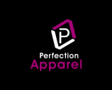


 Secure