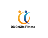
 oconsitefitness
 United States
Buyer
Joined: Dec 14, 2012
Posted On: Dec 20, 2012
Hi Designers,
I'm starting to see the building/ space aspect worked into more of your designs. Thank you for that.
Only 1 designer has played around with the concept that I uploaded (last). I would be interested in seeing more.
You might also do a Google Images search for 'commercial office building' to get some ideas of shapes.
I recommend avoiding images that too closely resemble a city sky-line (examples are #31, #36). Although these are buildings, the association to a city is not right for us.
Thank you!
Dao
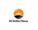
oconsitefitness
United States
Buyer
Joined: Dec 14, 2012
Posted On: Dec 19, 2012
Hi Designers,
Submission #29 and #30 are the most successful in terms of the text. I like the relative size and placement of 'Orange County' in #29. In #30, I like the use of two different colors in ONSITE, providing some emphasis.
However, I am still looking for something different with regards to the image and welcome ideas that address the space aspect.
I have uploaded an original idea from our team so feel free to play around with it/ improve upon it. You'll see that the image suggests a building complex.
Best,
Dao
oconsitefitness
United States
Buyer
Joined: Dec 14, 2012
Posted On: Dec 17, 2012
Hi Designers,
The most successful design will address both the 'onsite/ space' theme as well as the 'fitness' theme, as #10, #4 and #23 begin to do.
The designs that only incorporate the moving people are telling only half the story I hope to communicate.
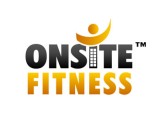
There also appears to be significant usage of moving figures in the designs so far. While this is not necessarily wrong, I would not limit your ideas to this only. Please see the Fitness Experience logo provided as an example. This logo successfully conveys movement/ fitness without using a person-like figure. I would be interested in seeing some ideas that is not just a person-figure.
Thanks, Dao
oconsitefitness
United States
Buyer
Joined: Dec 14, 2012
Posted On: Dec 16, 2012
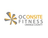
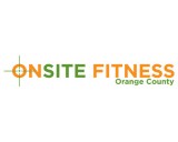
Hi Designers,
Again, thank you for your entries. As I review your designs, I realize the "OC" can be problematic because it confuses the emphasis. So I'd like to consider another option of how the company name/ geographic location can be addressed. Please see the newly uploaded file, 'Onsite Fitness - Orange County' and feel free to play around with this as the text rather than 'OC Onsite Fitness'.
Please note, if using the full geographic location, it should be less prominent than Onsite Fitness (as shown in my example or the CORE- Fitness and Nutrition logo example).
Just a reminder, the geography (i.e. Orange County) needs to be replaceable, meaning it could read San Diego, New York etc instead.
Best regards, Dao
oconsitefitness
United States
Buyer
Joined: Dec 14, 2012
Posted On: Dec 15, 2012
Thank you for your entries!
I like both the orange and orange-red colors used in submission #3 and #4. The grey background in #4 is intriguing although I'm uncertain of how that would work on a business card or letterhead because of the shape. i.e. is it just a grey rectangular? One of my logo examples has a colored background and I like the concept. But I think what makes it work in that case is the distinct shape.
Please note that OC should not be integrated into the graphics (refer to contest brief for explanation). The placement of OC in #3, #4, #5 would be ok as the 'OC' could be substituted with any letters. But, #1 and #2 would not work because of the integration of graphics in the OC.
Any visual emphasis (if there is one) should be on OnSite Fitness, rather than the OC.
Also, if there's capitalization than the S in OnSite should also be capitalized. (There does not necessarily need to be capitalization, i.e. both #3 with capitalization and #5 all caps are ok.)
Best regards! Dao
Admin
Posted On: Dec 14, 2012
Welcome and Thank You for Choosing LogoContest.com!
Here are some helpful hints to make sure you get the most out of our site, and your contest.
1. Please rank your submissions or post general comments a minimum of 1 time per day while your contest is running. This is required should you want to request an extension to your contest and will produce the best results from our designers.
2. Once your contest receives 40 design concepts, your prize amount will become "Guaranteed".
3. Please make the most out of our messaging and comment systems.
a) Place general comments on this main contest page to give all of the designers your preferences and what you would like to see or not see.
b) Clicking on any designers submssion will bring up a page of all submissions by that designer with an option to post private comments pertaining only to his work. (Only the contest Holder and that designer can view and post to this page)
c) Clicking on the designer username under a submission will allow you to send a completely private message to that specific designer.
4. Please "Eliminate" only those logo designs that you feel have no chance of winning your contest. (Be aware that eliminating everything may discourage participation from the designers.)
5. Please rank the designs 1 to 10 and there are also options to rank Elements you like, Colors you like, and Fonts you like. This will help guide the designers toward the design that you are looking for. For the best variety of designs, try not to keep the same design ranked #1 for an extended time as this may result in copying of that design.
6. We require that you do not ask one Designer to use elements or concepts from another Designer. The general rule is that, if a Designer was the first to use and submit the idea in one of their designs, they essentially own that concept or idea for the remainder of the contest. We will remove any deisgns that use copied concepts. Requests or ideas you have put in your Contest Brief or posted as contest attachments are fair game and open to everyone. Concepts that are considered obvious will also be fair game, for example: a dog & cat for a pet hospital, shopping bag for an e-commerce company, a tooth for a dentist, initials for a lawyer, etc.
7. Once your contest ends and is in judging mode, any revisions to designs that you request from the designers can be emailed to support AT(@) logocontest.com and we will enter them into your contest for you.
Discussion Guidelines:
1. Designers and Contest Holders please always be respectful of each other, we all have the same goal.
2. Please do not criticize any design publicly, these discussions should only be held in private.
3. Designers may not post any external links to any designs.
4. Please do not ask a contest holder to view your designs or discuss any other designs.
5. Designers can not discuss copied designs on the contest pages and may submit a Logo Dispute to the Admin only.
Our team at LogoContest.com as well as our designers will make sure you are 100% satisfied and want you to leave here with a design that you love!
Please recommend us to your friends and business associates for all of their logo design and web page design needs.
 (800) 995 - 6177


 Submission #95 By artespraticas (A.T.)
 Submission #60 By whitecat (A.T.)
 Submission #128 By whitecat (A.T.)
 Submission #51 By VenusDesign
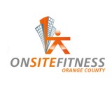 Submission #171 By artespraticas (A.T.)
 Submission #79 By whitecat (A.T.)
 Submission #99 By VenusDesign
 Submission #101 By VenusDesign
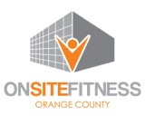 Submission #102 By VenusDesign
 Submission #111 By artespraticas (A.T.)
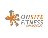 Submission #112 By artespraticas (A.T.)
 Submission #44 By artespraticas (A.T.)
 Submission #127 By whitecat (A.T.)
 Submission #132 By whitecat (A.T.)
 Submission #133 By whitecat (A.T.)
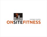 Submission #80 By whitecat (A.T.)
 Submission #156 By SETE7
 Submission #157 By SETE7
 Submission #52 By VenusDesign
 Submission #158 By SETE7
 Submission #159 By SETE7
 Submission #53 By VenusDesign
 Submission #88 By kidting
 Submission #56 By VenusDesign
 Submission #57 By Kebasen
 Submission #58 By whitecat (A.T.)
 Submission #59 By whitecat (A.T.)
 Submission #29 By kidting
 Submission #30 By kidting
 Submission #164 By zank (A.T.)
 Submission #165 By zank (A.T.)
 Submission #166 By zank (A.T.)
 Submission #94 By artespraticas (A.T.)
 Submission #169 By zank (A.T.)
 Submission #172 By Dhatz (A.T.)
 Submission #66 By artespraticas (A.T.)
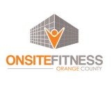 Submission #105 By VenusDesign
 Submission #148 By whitecat (A.T.)
 Submission #149 By whitecat (A.T.)
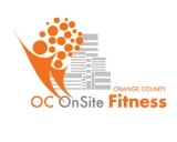
 Submission #100 By satyajit.S2010 (A.T.)
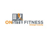


 Secure